1. Brand Identity
2. Apparel Design
3. Creative Direction
2. Apparel Design
3. Creative Direction
Heritage
Identity
Identity
The Cossacks were a warrior class in Ukrainian history, known for their horsemanship, bravery, and fiercely independent spirit. The Cossacks played a significant role in shaping the history of Ukraine, and their legacy continued to inspire and influence Ukrainian culture to this day.
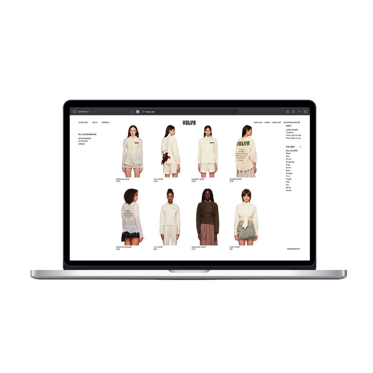
The brand identity is inspired by the fearless spirit of the Cossacks. The clothing features bold, practical designs, inspired by traditional Cossack attired, such as high-waisted pants, leather boots, and belted coats. The pieces are designed for both comfort and funcionality, and feature unique details, such as intricate embroidery, and leather accents. The brand’s visual identity features Cossack-inspired graphics, such as horses and stars, and a color palette of rich greens, browns,
and reds.
“Volya” is a Ukrainian word that means “will” or “determination.” This word speaks directly to the spirit of the Ukrainian Cossacks, who were known for their unwavering will and determination in the face of adversity.


“Volya” is a Ukrainian word that means “will” or “determination.” This word speaks directly to the spirit of the Ukrainian Cossacks, who were known for their unwavering will and determination in the face
of adversity.
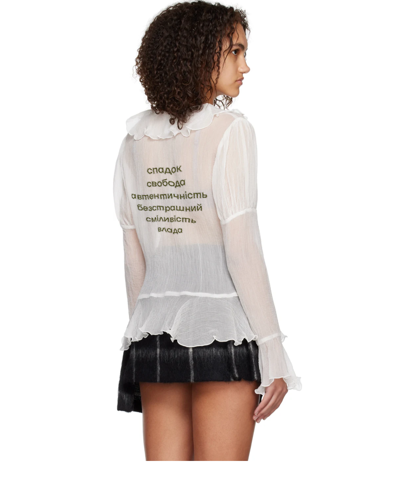
Using typography designed by Ukrainian designers was an important aspect of this project.
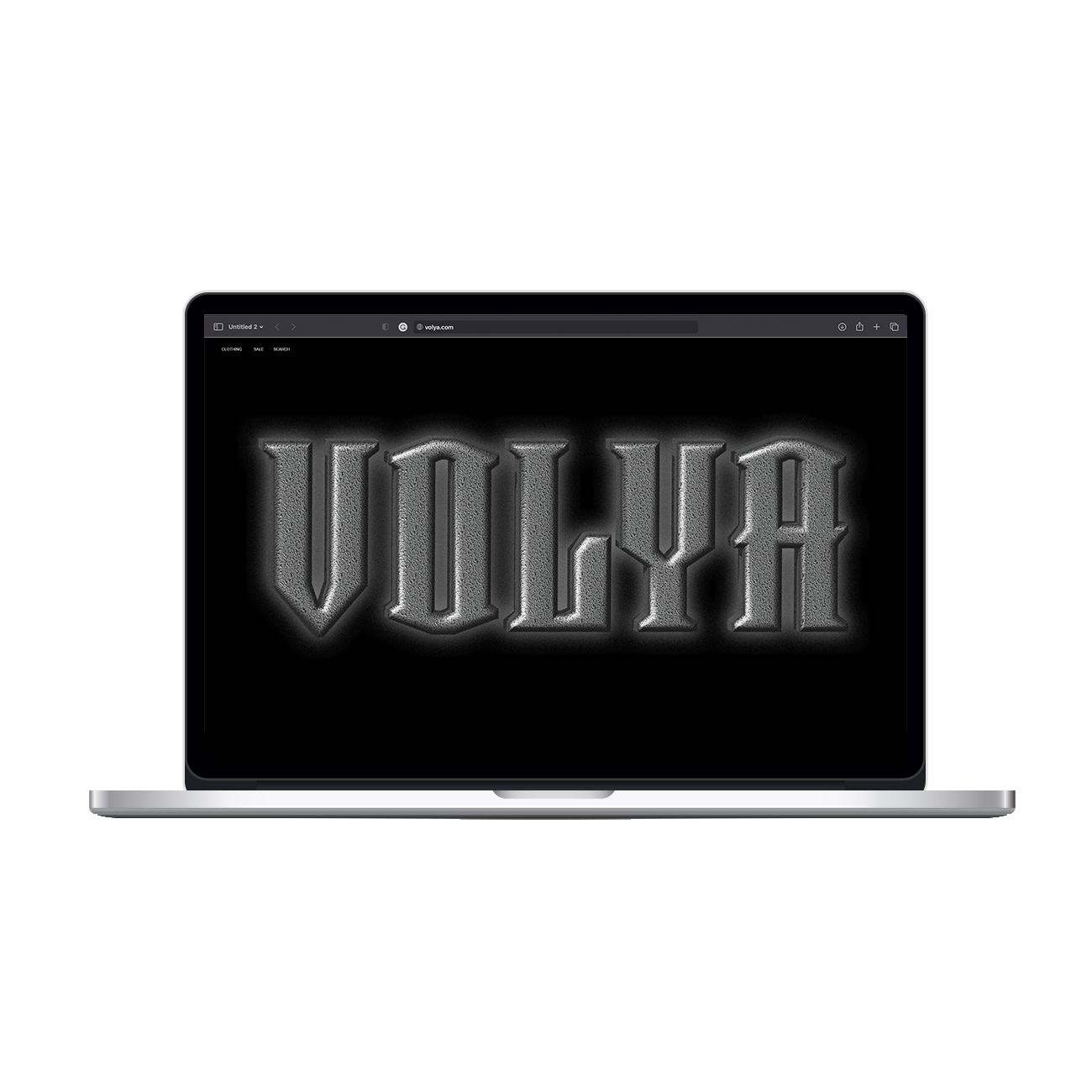
The primary logo for the Volya brand features the brand name written in Taurunum Ferrum Iron, a typeface that has been modified to look like metal, evoking the image of Ukrainian Cossack swords. The font choice is intentional, as it adds an element of authenticity to the brand, reflecting the brand’s inspiration from Ukrainian Cossacks. The use of metal in the font also reinforces the strength and durability associated with the Cossack spirit. The secondary logo features a stylized “V” from the primary logo, placed on top of the star-shaped handle from the Ukrainian Cossack sword. The handle and the “V” are also made to look like metal, creating a sense of unity between the two logos. This secondary logo provides a simpler alternative to the primary logo while still maintaining the brand’s connection to the Ukrainian Cossack heritage.